CRM and Data Visualization: From Data Analysis to Smarter Marketing
.avif)
Data visualization helps turn massive and complex datasets into easy-to-understand visual formats using charts, graphs, and interactive tools. By presenting raw information visually, marketers can more easily detect patterns, trends, and relationships—making decision-making faster and more accurate.
As more businesses adopt big data solutions, data visualization has become a critical technology across industries. For CRM systems in particular, visualization is indispensable. Marketers handle large volumes of customer data every day. Visualization not only improves data interpretation but also enables real-time tracking of customer segments and behavior—helping teams develop more targeted and effective strategies.
JuicySuite’s Approach to CRM Data Visualization
There are many types of data visualization methods and tools on the market. But how do you choose the right one? Here, JuicySuite breaks down the most common types of data visualization—and how they support CRM and marketing analysis.
Popular Types of Data Visualization for CRM
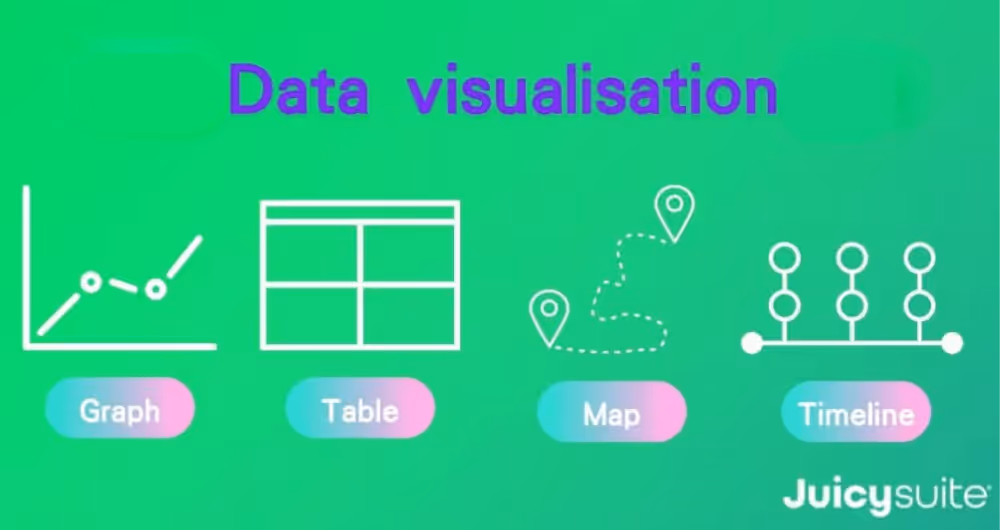
Graphs and Charts
Charts are among the most widely used visualization formats. The human brain processes images much faster than text, so representing data visually helps marketers quickly understand performance trends and channel behavior. Graphs are ideal for analyzing sales trends, marketing ROI, and campaign performance over time.
Tables
Tables provide structured views of data in rows and columns, ideal for quick referencing and detailed comparison. Their flexibility makes them suitable for tracking customer records, monitoring KPIs, managing budgets, or analyzing survey responses.
Maps
Geographic data visualization shows how customer data is distributed across regions. With the right map type, you can easily visualize where your strongest markets are, or how promotions perform in different areas—helping you localize strategies and make data-driven regional decisions.
Timelines
Timelines organize events chronologically, helping teams understand progress over time. In CRM, timelines are used to track customer journeys—from first brand interaction to final purchase—or to evaluate the success of seasonal campaigns or onboarding flows.
Each format plays a distinct role, and as marketers, we often need multiple views to support decision-making, build monthly reports, or create presentation decks. That’s where data dashboards come in.
What Is a Data Dashboard and Why Does It Matter?
A data dashboard consolidates different types of visualized data into a single, interactive interface. Unlike platforms like Google Analytics or Facebook Business Suite, which often overwhelm users with data, dashboards are designed for quick interpretation.
Well-designed dashboards simplify insights by:
- Filtering out irrelevant noise
- Highlighting key performance metrics
- Enabling drill-downs into customer segments
- Supporting faster executive decisions
At JuicySuite, dashboards are built for marketers, not data scientists—so you don’t need coding experience to generate insights.
Common Data Visualization Tools
You might be wondering: What tools are commonly used to build dashboards?
For Business Users
Excel is still a go-to for many teams, offering ease of use for tabular reporting and basic charts. Tableau, on the other hand, is a robust tool for creating dynamic, interactive dashboards. It can be used alongside Excel to create deep-dive reports and insights through an intuitive interface.
For Data Analysts
More technically inclined teams may use tools like R, SQL, or Python. These are programming languages tailored to data science and analytics.
- R is focused on statistical modeling and visual analytics
- SQL is used for querying large datasets from databases
- Python is highly flexible and supports both data analysis and system development
While powerful, these tools require specialized training and are less accessible to non-technical marketers.
Need a Faster, Simpler Solution? Use JuicySuite CRM
JuicySuite is an all-in-one CRM platform with built-in data visualization features. No coding required. Marketers can easily build custom dashboards tailored to brand and campaign needs.
Our system:
- Combines AI with visual storytelling
- Replaces cluttered spreadsheets with real-time dashboards
- Offers multidimensional filters and segmentation tools
- Predicts customer behavior and lifetime value
- Supports data-driven planning and campaign optimization
Whether for reporting or executive presentations, JuicySuite makes data more accessible and useful for marketing teams.
Want to see how CRM data visualization can help your business grow?
Schedule a free consultation with JuicySuite’s CRM experts today. Discover how to turn raw data into real-time insights and strategic action.
Explore more JuicySuite CRM features
.png)